

Himachal Spice
Pawsitively Healthy
Year
2025
Industry
FMCG
Service
Branding, Packaging
Himachal Spice Co. came to us with an AI-generated logo and a vision to build a regional food brand rooted in the flavours of the mountains. While the intent was clear, the identity lacked soul, distinctiveness, and cultural depth. We saw an opportunity to move beyond a generic mark and craft a brand that truly felt like Himachal — grounded, bold, and story-led. The goal wasn’t just to redesign a logo; it was to build a visual world that could carry the richness of traditional pickles into modern retail.
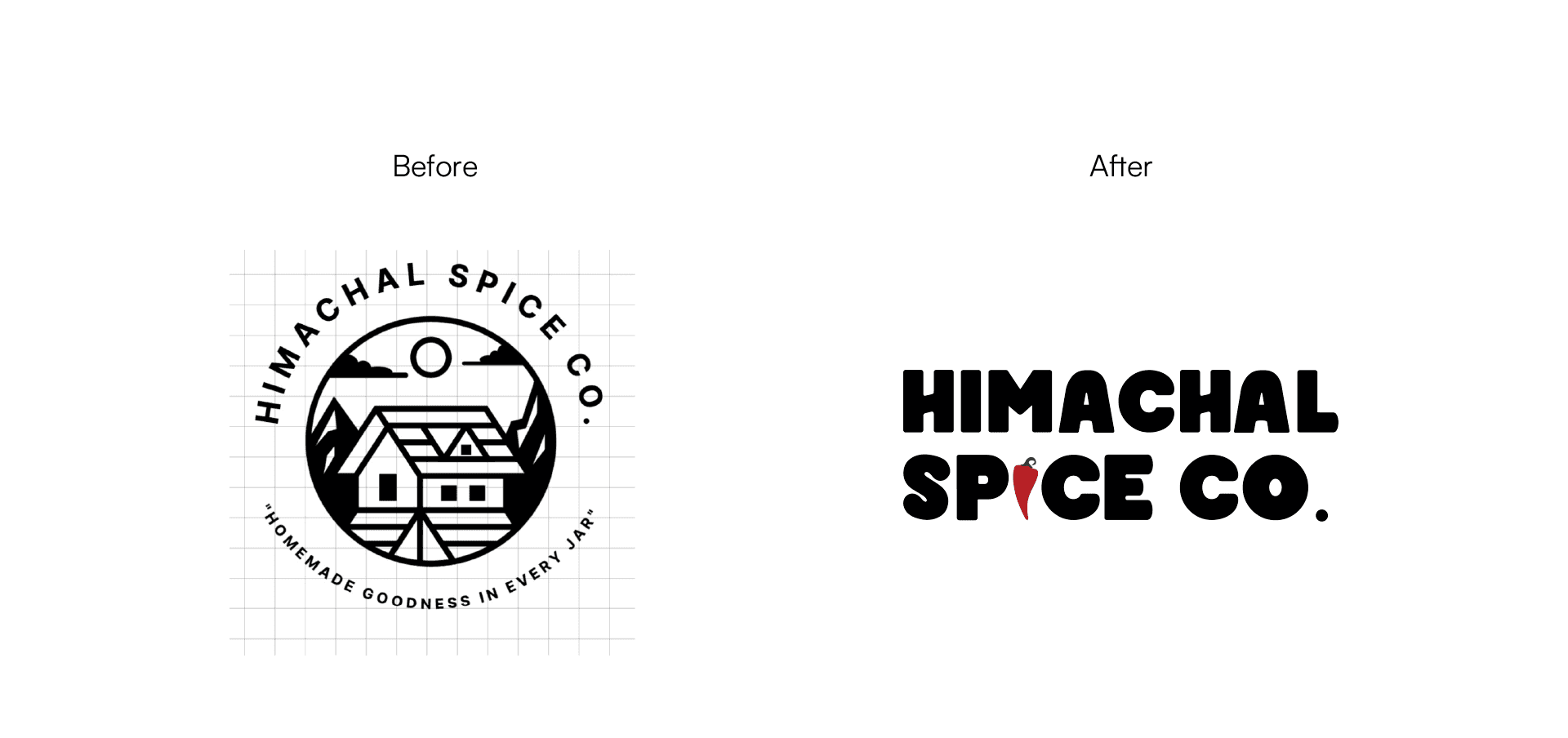


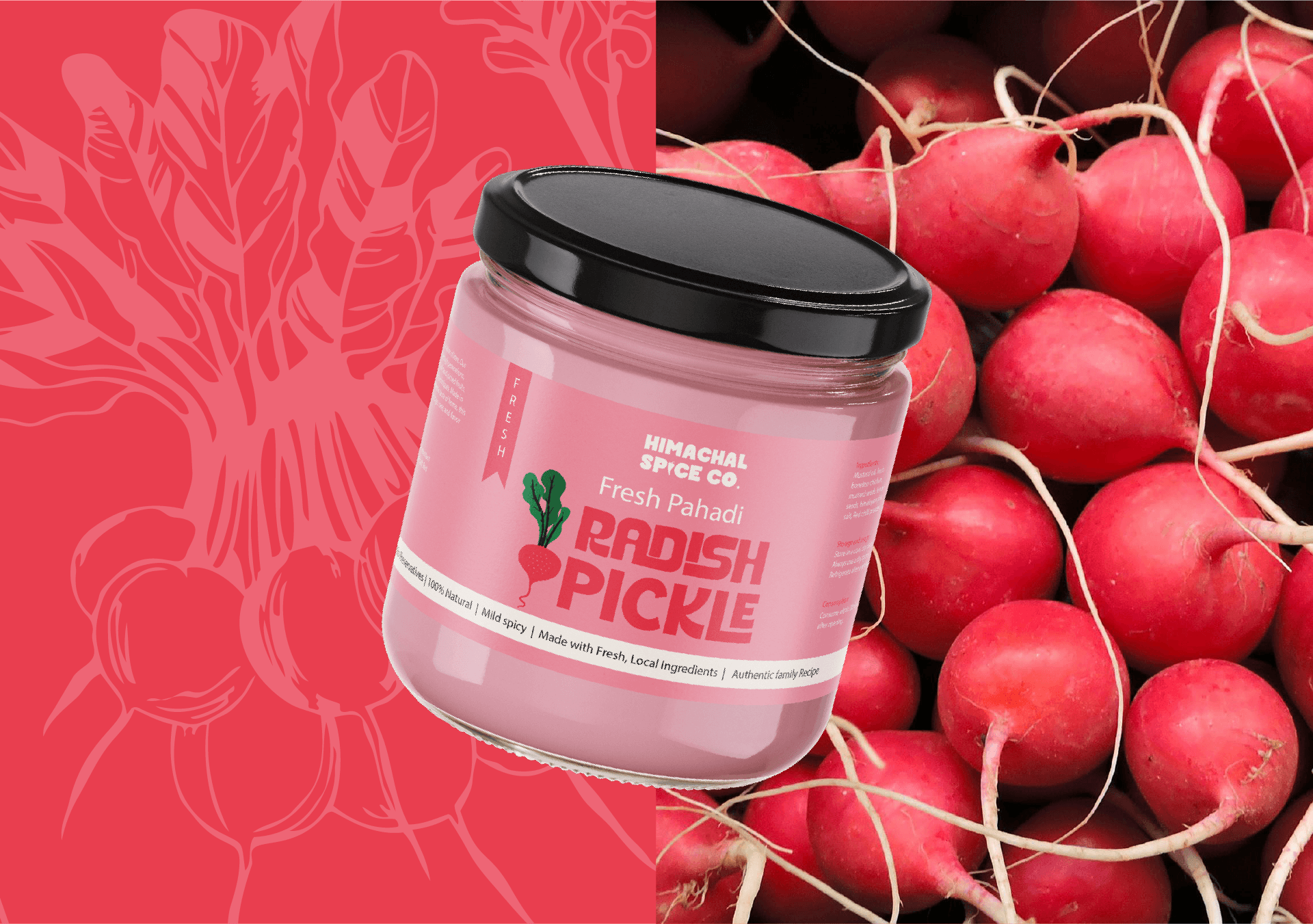
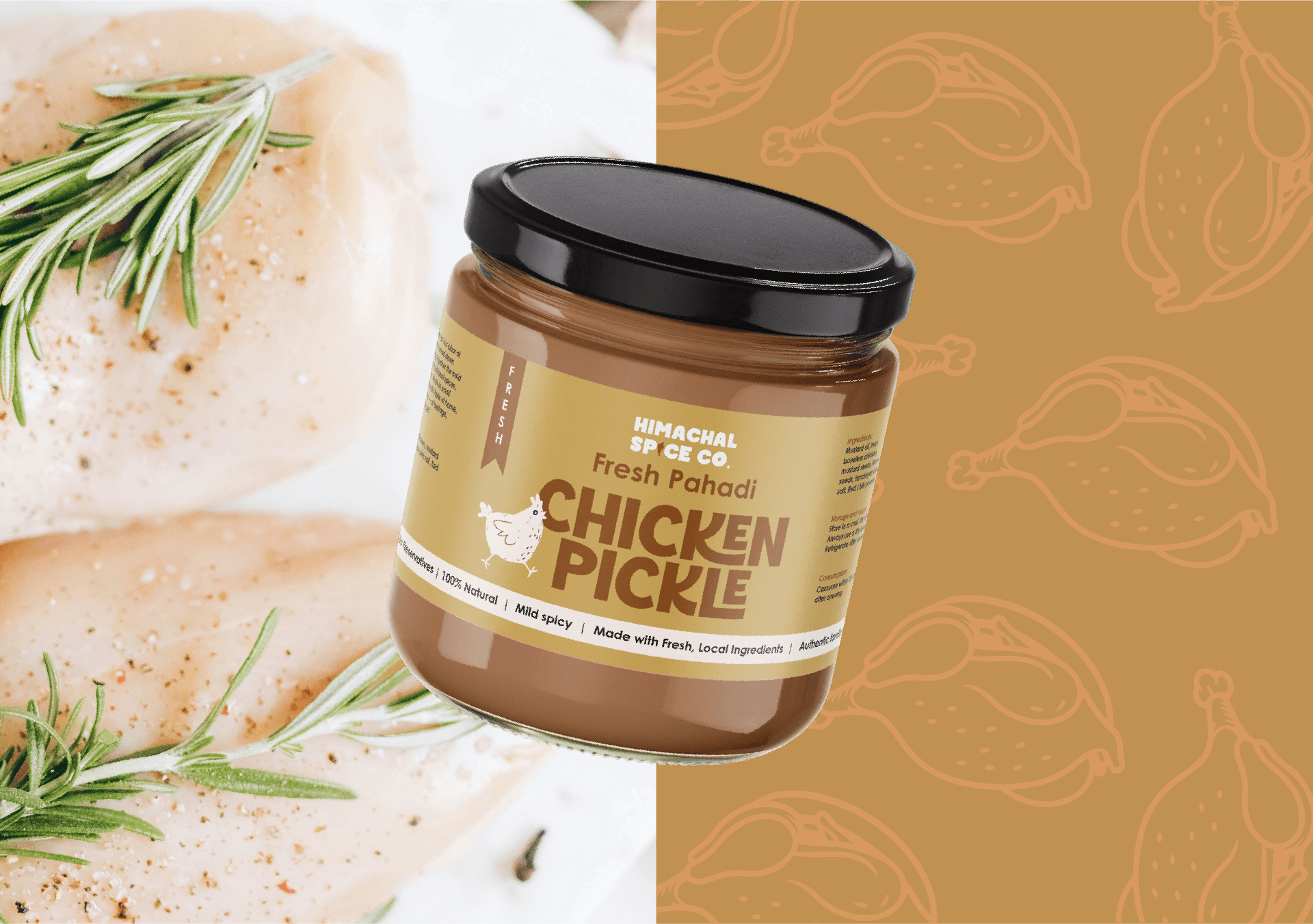
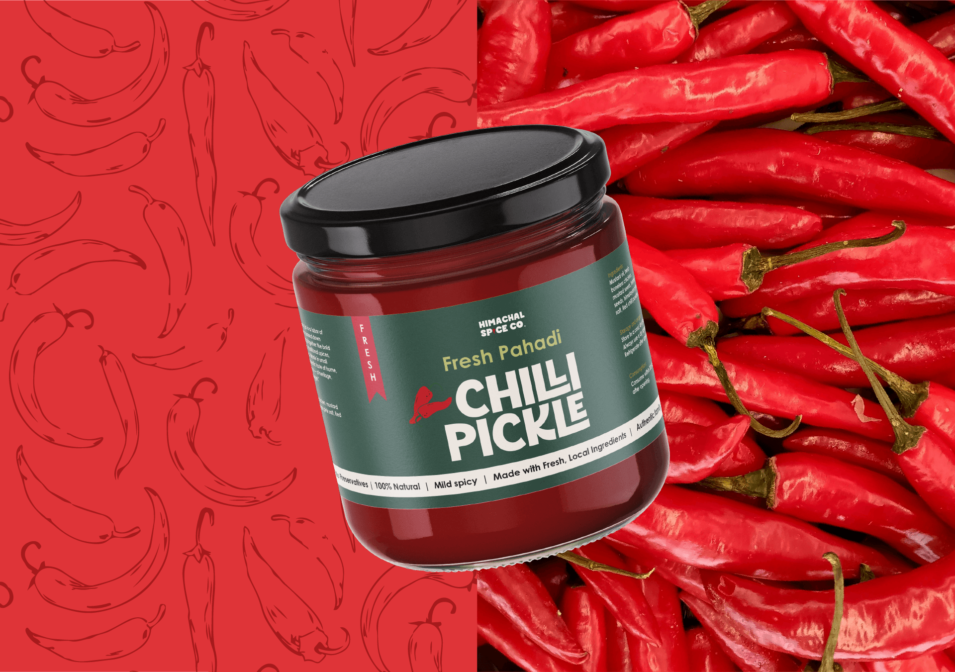
We reimagined the identity from scratch — creating a custom logo system, packaging architecture, and a cohesive visual language inspired by the landscapes of Himachal Pradesh. The colour palette drew directly from the region: mountain browns, forest greens, sunrise oranges, river blues, and earthy reds. Each product variant was assigned its own expressive yet rooted palette — from the deep warmth of Chicken Pickle to the sharp vibrancy of Chilli and the freshness of Garlic Vinegar. Subtle illustrations and patterns added character without overpowering the product, allowing the flavours to remain the hero.

The final outcome was a bold, shelf-ready brand that feels both traditional and contemporary. From jar labels to merchandise extensions like aprons and recipe cards, every touchpoint carries the same mountain-inspired personality. What started as an AI-generated logo evolved into a distinctive regional food brand with depth, coherence, and strong recall. Himachal Spice Co. is now positioned not just as a pickle brand — but as a flavour story from the hills.

Works that we proud of

Vibevest
Contemporary fintech branding with youthful energy.

Yogavani
Earth-toned identity inspired by mindful living.